Thursday 29 April 2010

Music break - Blues & Jazz

1. Sarah Vaughan – Whatever Lola wants 


2. Melody Gardot – Your heart is as black as night


3. Billie Holiday – Lover man 


4. Gorge Benson & Kenny G – Summertime


5. Ella Fitzgerald –  Blue moon 


6. Chet Backer - My Funny Valentine


7. Frank Sinatra – I love Paris 


8. Barbara Streisand – Cry me a river 


9. Diana Krall – Temptation


10. Miles Davis – Generique

Wednesday 28 April 2010

Yayoi Kusama - Dots obsession

Dot's Obsession


Fireflies on the water


Narcissus Garden

Yayoi Kusama is the most famous Japanase contemporary artist, she is well-known all over the world for her colorful polka dots! Born in 1929 near Nagano,  Japan. Started to paint using polka dots and nets as motifs at around age ten, and created fantastic paintings in watercolors, pastels and oils. Went to the United States in 1957 where she became famous and in 1973 she came back to Japan. I couldn’t simply describe all the biography, she’s 80 years old and she, starting with paints, passes through installations, live performances, novels and poems.. I’ve tried to posted here her most famous works, that better describe her artistic evolution.

Yayoi Kusama è l’artista contemporanea Giapponese più famosa, è conosciuta in tutto il mondo per I suoi coloratissimi pois! Nata nel 1929 vicino a Nagano, in Giappone. Ha iniziato a dipingere usando pois e reti come motivi ricorrenti già età di 10 anni, creando fantastici dipinti a pastelli o ad olio. Nel 1957 si è trasferita negli Stati Uniti dove è diventata famosa e nel 1973 è tornata in Giappone. Non posso semplicemente descrivere tutta la biografia, l’artista ha 80 anni e iniziando dai dipinti è passata alle istallazioni, alle performance dal vivo, ai racconti e alle poesie… Qui, ho provato apostare le sue opere più famose, che meglio descrivono la sua evoluzione artistica.


I want to live forever


Flowers that Bloom at Midnight


The artist

For further information see also http://www.yayoi-kusama.jp/

Monday 26 April 2010

Lia Saile - Poetry and story telling

From the series "Silence"


From the series "Black Silver"


From the series "Silence"

In this post I will present one of my favourite contemporary artist. I’ve tried to interview her, but she wrote me that she was too busy. So, I hope she will answer as soon as she can. While I’m waiting for her replay, I posted here some of her works.

Lia Saile is a German young artist, graduate in Theatre-, Film- & Media-studies at University of Vienna and than moved for a period to Malta where she mainly focus on her photographic career. I knew her on Deviant Art and than I continued to follow her on the web site Scattered Sea (see the link below). Her works makes a great impression to me for the story- telling line usually use in every project, and for the deep poetry content that comes out from every single work.

In questo post vorrei presentare una delle mie artiste preferite. Ho provato a intervistarla, ma lei mi ha risposto che era troppo occupata. Così, spero che risponderà appena le sarà possibile. Mentre aspetto la sua risposta, pubblico sul blog qualche suo lavoro.

Lia Saile è una giovane artista tedesca, laureata in studi di Teatro, Film e Media all’Università di Vienna e poi trasferitasi a Malta dove si è concentrata sulla fotografia. L’ho conosciuta su Deviant Art e ora continuo a seguirla sul suo sito internet Scattered Sea (di cui sotto ho scritto il link). I suoi lavori mi piacciono in particolare per il sottofondo narrativo che sta dietro a ogni progetto, per il forte contenuto poetico che viene fuori da ogni singolo lavoro.

For further information see also http://www.scattered-sea.com/deux/start.html , http://www.seafairy.deviantart.com/  and http://www.polanoir.com/standard?artistid=71

From the series "In Between"


From the series "In Between"


From the series "Zum ursprung"

Thursday 22 April 2010

James Aldridge - Flowers, plants and heavy metal


James Aldridge was born in 1971, in UK, but today he lives and works in Sweden. His artistic works are a mix of naturals book and heavy-metal cd cover! Plants, flowers, colorful images are combined with skulls and ravens. Such dichotomy, as life and death, catch my attention and rise my curiosity to learn more about this artist! Wasn’t easy at all!  No web-site, no blog articles, just press. This is the best, with all the articles together (http://www.poppysebire.com/artists/James_Aldridge_press.htm ).
Since 2005 James Aldridge has been working in isolation in a Swedish forest listening to heavy metal. Having been a fan in his early teens, Aldridge recently rediscovered this music as a kind of nostalgia. Aldridge takes inspiration from the serious, heartfelt nature of the music and the rather contradictory, often clichéd nature of some of the imagery and subject matter.
The choice to make work in a relative wilderness has allowed him to become immersed in his subject matter and as a result there has been a shift in his relationship to it. Early works show an idealised and harmonious engagement with the beauty of the natural world. However, this has now given way to a more sinister macabre portrayal, suggestive of a more complex relationship with his environment, altering and confusing the exchanges between the characters and wildlife within the works themselves.

James Aldridge è nato nel 1971 in Gran Bretagna, ma oggi vive e lavora in Svezia. I suoi lavori sono un mix di libri sulla natura e copertine di cd heavy metal! Piante, fiori e immagini colorate sono accostate a teschi e corvi. Questa dicotomia, come vita e morte, ha catturato la mia attenzione e stuzzicato la curiosità di sapere di più di questo artista! Ma non è stato per nulla facile! Non ci sono web site o blog che parlino di lui, solo alcuni articoli di giornale. Questo indirizzo è a mio parere il migliore con tutti gli articoli messi insieme (http://www.poppysebire.com/artists/James_Aldridge_press.htm ).
Dal 2005 James Aldridge ha lavorato isolato nella foresta Svedese ascoltando heavy metal, genere musicale riscoperto dall’artista che ne era già fan durante l’adolescenza. Aldridge prende ispirazione dalla seria e sentita natura di questa musica e dal piuttosto contraddittorio e spesso stereotipato immaginario che le fa da sfondo. La scelta di lavorare nella foresta gli ha permesso di essere quasi totalmente immerso nel suo soggetto creativo e il risultato è stata un’evoluzione del suo rapporto con esso. Se I primi lavori, infatti, mostrano un rapporto ideaizzato e armonioso con la bellezza della natura circostante, gli ultimi sono decisamente più macabri e sinistri. I lavori più recenti di Aldridge svelano un rapporto più complesso con l’ambiente, alterando e confondendo gli scambi tra I soggetti, la natura e i lavori stessi.

All the works posted here are from James Aldridge.


Wednesday 21 April 2010

Viola Di Massimo interview - Orange hats and theatrical mannequines


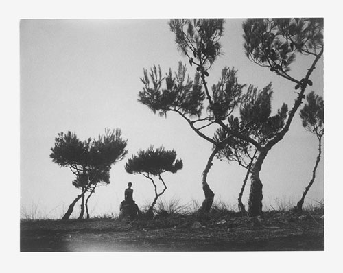
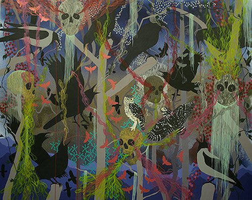
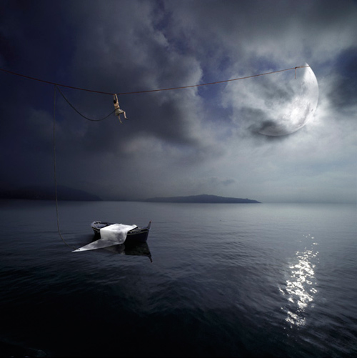
This time the interview doesn’t follow the usual question path, but I want likewise to present the artist’s thought and leave it as much intact as possible. The artist is Viola Di Massimo, born in Rome in 1970. Above it is present her point of veiw (All the posted images are Viola Di Massimo works.)

It is not easy for me to speak about what I paint, I admit, it never be. It is hard because every art work is a little life peace that will join the following one and so on, coloured or black and white images coming one after the other. Just like in a photographic shoot where you stop a person life instant, fixing this piece of present in a bidimensional image and than, if you put all together the result is a life summary. For me is the same: if I put together my artworks, all these presents fixed on canvas tie together, I find out that I have a real past and that in front of me I have a life, which in this case it is mine. I don’t know how it will be end, nobody know it. But tomorrow, for sure, I will find out more and I will build an other piece of present to fix on canvas. I’m an artist from 1986 and I never give up, my life is based on art and research through art is everything for me. You asked me what I’m looking for through art, but I don’t know the answer, because if I do probably my search will be end. But while searching you can find very interesting paths, and by now everyone knows that is more important the path than the aim. I will tell you the last tried path, its name is “Fairytale for a April silence”, it was created for the Abruzzo earthquake recurrence and it is a live performance. This work make me aware that we must always say things, in any way ideas must be express, and blog as yours must be written to talk about yourself or other people, or about discoveries, and this should never end. At the question “What do you want to transmit through your works?” I will answer more precisely: communication, I want to continue to communicate, also with no words, because as you show me creativity is a silence shout that can be heard everywhere, in this case was heard by you in Milan.

L’intervista di questa volta non segue esattamente la scaletta solita di domande, voglio però proporre e lasciare il più possibile intatto il pensiero dell’artista e il suo punto di vista, qui sotto esposto. L’artista è Viola Di Massimo, nata a Roma nel 1970. (Le immagini postate sono tutte opere di Viola Di Massimo).

Non mi è facile parlare di ciò che dipingo, ammetto che non lo è mai stato. E' così difficile perché ogni quadro è un pezzettino di vita che si unisce al quadro successivo e poi, ancora, a quello dopo e quello dopo ancora, in un susseguirsi di immagini a colori o in bianco e nero, esattamente come accade in uno scatto fotografico, in cui si ferma un pezzo di vita di una persona ogni tanto, si imprime quel "presente" in un'immagine bidimensionale e poi, se si uniscono tutte, ne viene fuori la sintesi di una vita.
Lo stesso è per me: se unisco un'opera dietro un'altra e tutti questi presenti immobilizzati su tela li lego uno con l'altro, scopro che ho un passato concreto e ne faccio una vita, in questo caso la mia. Non so ancora come andrà a finire come non lo sa nessuno ma di certo, domani, scoprirò altro e mi costruirò un altro presente da bloccare su tela. 
 Sappia che faccio arte, (non trovo un'espressione più discreta), dal 1986 e non ho mai smesso, che la mia vita è basata su questo e che la ricerca attraverso l'arte è tutto.
Mi chiede cosa cerco dalla pittura ma io, cosa cerco, non lo so ancora sennò avrei smesso di cercare, ma cercando, si trovano e provano infinite strade e siccome sappiamo quasi tutti ormai, che è più importante il viaggio che la meta, io continuo a cercare.
L'ultima strada che ho trovato e provato però gliela racconto molto volentieri. Questa volta ha un titolo, a differenza dei quadri ad olio, una motivazione, non così intima e difficile da raccontare come è nei dipinti, e non è un olio su tela. In ogni caso sarà certamente un altro presente da legare alle opere precedenti che però può appartenere più fortemente anche a lei, non solo come sensazione come potrebbe essere per i dipinti ma come memoria comune, "cicatrice" comune.
Si intitola "favola per un Silenzio d'aprile" è stata creata per la triste ricorrenza del terremoto in Abruzzo, ed è una performance.
Questa strada che ho trovato e poi provato continuando a cercare, mi ha fatto comprendere un pochino di più di quanto già in parte sapevo, che le cose vanno dette, sempre; che sia attraverso un dipinto, una fotografia, uno spettacolo teatrale o una piccola performance fatta in uno studio d'artista, le cose vanno dette. Le idee espresse (e anche realizzate), i blog come il suo vanno scritti per raccontare di sé degli altri e delle proprie scoperte e mai, mai, tutto questo dovrà avere fine.
Su una domanda che mi ha fatto "cosa vorrebbe trasmettere attraverso I suoi lavori", però le rispondo più precisamente: comunicazione, voglio continuare a comunicare anche senza parole perchè come mi ha dimostrato anche lei la creatività è un urlo silenzioso che può essere colto da ogni dove e in questo caso, è stato colto da lei, a Milano.

Viola Di Massimo

For further information see also www.violadimassimo.com
“Fairytale for an April silence” link : http://www.violadimassimo.com/oltre.php, sorry but the speech is in Italian :-).


Monday 19 April 2010

Qubo Gas - Artistic Hybridization


Qubo Gas is a French artist group founded in 2000 in Lille. Behind the name there are 3 artists: Jean-François Ablézot, Morgan Dimnet, Laura Henno. Experts use the term rhizome to illustrate Qubo Gas artistic work. A rhizome, from which a network of roots and aerial adventitious stems grows, is a moving process with neither beginning nor end.
They started their work with pencil drawn, coloured, painted on paper or screen. This forms the initial substratum on which digital works will be composed. The hybridization, characteristic of Qubo Gas’s work, comes from here, advanced technology and sample drawings. For example, for Shimmy Shimmy Grass, one hundred and fifty species have been listed, living exclusively in a digital space just for the period of an exhibition; they appear, grow, then wither according to the surrounding climate. This synthetic garden is  Qubo Gas's emblematic work , awarded at the Split (Croatia) digital art festival.

Qubo Gas è un gruppo di artisti francese nato nel 2000 a Lille. Dietro il nome ci sono tre artisti: Jean-François Ablézot, Morgan Dimnet, Laura Henno. Gli esperti usano il termine rizoma per descrivere il lavoro di Qubo Gas. Un rizoma è un processo in movimento senza inizio né fine, dal quale diparte una rete di radici e di gambi e fusti.
Il loro lavoro ha inizio con un disegno a matita, che viene colorato, e dipinto o su carta o su uno schermo. Esso forma la base sulla quale viene creato il lavoro digitale. L’ibridazione, elemento caratteristico dei lavori di Qubo Gas, arriva da qui: tecnologia avanzata e semplice disegno. Per esempio, per Shimmy Shimmy Grass,  centocinquanta specie sono state incluse nell’opera, vissute esclusivamente in un ambiente digitale per il periodo della mostra. Esse nascevano, crescevano e appassivano a seconda del clima circostante. Questo giardino sintetico è il lavoro emblematico di Qubo Gas, premiato allo Split, festival di arte digitale in Croazia.

For further information see also www.qubogas.com


Thursday 15 April 2010

French playlist

Today, I want to have a brak from art. I would like to propose some music! They are all french songs! Enjoy it!

Oggi, vorrei fare una piccola pausa dall'arte e proporre un po' di musica! Sono tutte canzoni francesi ! Buon ascolto!


1. Louis Garrel, Ludvine Sagner & Clothilde  - Je n’aime que toi

2. Felipecha - Un petit peu d’air 

3. Thomas Dutronc - J’aime plus Paris 

4. Fille Atomique - Nous non plus 

5. Koxie – Ma meilleure amie

6. Berry - Mademoiselle

7. Jeune, Je ne savais rien – Thomas Dutronc

8. Yelle – A cause de Garçons

9. Cœur de pirate – Printemps

10. The krolls – La cocaine, le chocolat

Wednesday 14 April 2010

Alastair Magnaldo - Dream scenary and photo manipulation


Today, I want to present a French photographer: Alastair Magnaldo. In his images (Some are posted here) he created these sceneries similar to dreams or visions.
In order to make them he takes 7 hours: about half an hour scanning, six hours in all for the computer work and about another half hour for the print. The most harder thing for the artist is to show every detail on a 40x40 print. He starts writing down the ideas, sketching the scenes, and making lists of elements he needs. For his sceneries, it often means waiting for the ideal situation, maybe collecting elements in the outside world. Than he begins the computer work that consist of assembling, positioning, orienting and colour matching, and “cleaning-up” work on the details. Here the difficulty is to find a compromise between the initial idea and its translation into the image.
Although the manipulation process for the artist this remain photography not only because every piece of the composition is a photograph, but the process of fixing “something” is exactly the same as more traditional photographers.

Oggi vorrei presentare un fotografo francese: Alastair Magnaldo. Nelle sue immagini (alcune delle quail sono postate qui) egli crea degli scenari simili a sogni o visioni. Per completare un lavoro ci vogliono 7 ore: circa un’ora e mezza di scansione, sei ore per il lavoro al computer e un’altra ora e mezza per la stampa. La cosa più difficile per l’artista è mostrare ogni dettaglio in una stampa 40x40. Incomincia scrivendo le idée, facendo uno schizzo della scena e una lista degli elementi che gli servono. Per le sue opere spesso significa aspettare per la situazione ideale e collezionare elementi dal mondo. Dopo di che inizia il lavoro al compiuter: posizionare, orientare e aggiustare I colori, infine ripulire l’intero lavoro. Qui la difficoltà principale risiede nel trovare un compromesso tra  l’idea iniziale e la sua trasformazione in immagine. Nonostante la manipolazione del lavoro, per l’artista questa rimane ancora fotografia non solo perchè ogni pezzo della composizione è una fotografia, ma soprattutto perchè il prcesso consiste nel “fissare” qualcosa ed è lo stesso della fotografia tradizionale.

For further information see also www.almagnus.com


Monday 12 April 2010

Mikko Sinervo interview - Between light and perceptions


Hi everyone! I have a new interview! The artist is Mikko Sinervo based in Helsinki, where he was born in 1981. In particular I asked him questions about his series “Afterimages”(here there are posted some images taken from the series personally chosen by the artist). These works caught my attention for the colours combination that at the beginning gave me the impression of move in circle inside the canvas.

-Where does the idea of the series come from?
-The whole series is based on the afterimage that sun had left on my retina. Accidentily one morning while I was pulling bed room curtain aside, the sun hit my eyes. The bright light created a circle shaped image on my retina. The image was constantly moving with pulsating colors. As the color combinations were very powerful and beautiful, I tried to memorize as much as possible. Based on my experience and memory, I created small drawings and / or sketches on my notebook. Afterwards I tried to restore the images as powerful as it was by using digital workflow as a tool. Traditional darkroom techniques did not meet my thoughts at this series.

- I suppose that there is a study behind the choice the colours: what kind of research do you follows?
-There is not particulary that much of color studies considering the series. Of course when I was re-composing the afterimages I tried to achieve as powerful and pulsating result as possible. This is of course based on the relationships between different colors and their intensity in brightness. So, in this sense one can say that there is some amount of color studying.

-What do you want to communicate with this series?
-My act is to focus on what I look at and how I percieve it. I try to use myself as the tool of the reflection by the use of my memory. I also want to get the viewer to be conscious that the beauty can be found close. When looking my work (Afterimage in this case) I hope that the viewer takes time observing it. By this one might look back to one´s own perceptions.

-What will your next work be?
-At this point I am working on few different projects. In all of the projects the combining theme is light. I think some of the up-coming work will, at some degree, will include more three dimensional representation. During the summer I also prepare to do some amount of painting. But the light is still the main key for my work.

Ciao a tutti! Ho una nuova intervista! L’ artista si chiama Mikko Sinervo, vive a Helsinki dove è nato nel 1981. L’intervista si è focalizzata sulla serie di lavori “Afterimages”(Ho postato qui alcune immagini personalmente scelte dall’artista). Questi lavori mi hanno colpita per la combinazione di colori, messi in modo tale che all’inizio mi avevano dato l’impressione di muoversi in cerchio all’interno della tela.

- Da dove viene l’idea della serie?
Tutta la serie è basata sull’immagine lasciata dal sole sulla mia retina. Accidentalmente una mattina, mentre stavo tirando da parte le tende della stanza da letto, la luce del sole mi ha colpito negli occhi. La luminosità della luce ha creato un immagine circolare sulla retina che continuava a muoversi con colori pulsanti. Siccome la combinazione di colori era particolarmente potente e bella, ho cercato di memorizzarla il più possibile. Basandomi sull’esperienza e la memoria, ho così creato piccoli disegni o schizzi sul mio notes, che successivamente ho cercato di ricostruire e di ricreare la stessa intensità con l’utilizzo di un supporto digitale. Poiché le tradizionali tecniche della camera oscura non incontravano le mie esigenze per questa serie.

- Suppongo che ci sia uno studio dietro la scelta dei colori: che tipo di ricerca hai seguito?
In realtà non c’è un particolare studio dei colori per questa serie. Ovviamente quando ho ricostruito le immagini ho cercato di ottenere un risultato che fosse più di impatto possibile. Per ottenerlo ho certamente dovuto tenere conto delle relazioni tra i diversi colori e della loro intensità luminosa. Ma solamente in questo senso si può dire che esiste una sorta di studio dei colori.

- Cosa intende comunicare al pubblico con questa serie?
Il mio lavoro si focalizza su quello che osservo e come lo percepisco, provo a utilizzare me stesso come mezzo di riflessione attraverso l’uso della memoria. Vorrei anche rendere lo spettatore conscio che la bellezza può essere trovata vicina a noi. Quando il pubblico guarda i miei lavori, spero che si prenda tempo per osservarli, in tal modo riesce a risalire alle percezioni dell’artista.

-Quale sarà il tuo prossimo lavoro?
In questo momento sto lavorando a progetti differenti in cui il filo conduttore è la luce . Penso che il prossimo progetto, in qualche modo, includerà rappresentazioni tri-dimensionali. Durante l’estate ho anche programmato di dipingere alcune tele. In ogni caso la luce rimane il principale soggetto dei miei lavori.


Friday 9 April 2010

Daniela Edburg - Colours and provocation


From the series "Drop dead gorgeous"


From the series "Killing time"


From the series "Killing time"

Daniela Eduburg is a photographer, born in Houston, TX in 1975 and grew up in Mexico. In 2009 her work was shown in Photoquai, second Biennale of Images of the World in Paris, France.
Her photography has a strong impact, the artist’s aim is to provoke, arouse a reaction. All her images call to mind famous portraits or famous films scenes. Daniela Edburg’s works leave a sense of disorientation in the spectator, which is created combining beautiful women portraits with death or destruction themes.
For example the series “Drop dead gorgeous”, strongly ironic and cynical, where the photographs subjects are female corpses all dead cause of having too much fed. Through these works the artist want to highlight the obsessive relationship between women and food.

Daniela Edburg è una fotografa, nata a Houston, TX nel 1975 e cresciuta in Messico. Nel 2009 il suo lavoro è stato esposto a Photoquai, seconda Biennale di Immaginial mondo a Parigi, Francia.
La sua fotografia è di forte impatto, l’obiettivo dell’artista è di provocare, di suscitare una reazione. Tutte le sue immagini richiamano alla mente famosi dipinti o immagini di film conosciuti. Le opere di Daniela Edburg lasciano nello spettatore un senso di disorientamento, creato dall’associazione di ritratti di donne bellissime con temi di morte e distruzione.
Ad esempio, la serie “Drop dead gorgeous”, fortemente ironica e cinica, dove I soggetti delle fotografie sono cadaveri di donne morte per essersi nutrite troppo. Attraverso questi lavori l’artista vuole sottolineare la relazione talvolta ossessiva che le donne hanno con il cibo.

For further information see also http://www.danielaedburg.net/


From the series "Drop dead gorgeous"


From the series "Drop dead gorgeous"


From the series "Killing time"


From the series "Killing time"

Wednesday 7 April 2010

He Sen - Exhibition in Milan


Today I want to present a Chinese artist, his name is He Sen, and he was the chosen painter to represent China in the last Venice Biennial. He was born in 1968 in Yunnan Province, China. Studied art first in China, later in Germany and currently teaches at the Central Academy of Fine Arts in the Department of Photography and Digital Media in Beijing.
Primo Marella Gallery in Milan dedicates an exhibitions with a selection of the artist latest works, from April 8th until May 30th.
He Sen paints distinguish themselves for the peculiar technique used to establish an intimate contact with the spectator.
Part of the exhibition is dedicate to the “Smoking Girls”, the most famous works of the artist. The works were born from a photography shoots of young girls find themselves in daily moments: while smoking, playing or drinking. Subjects created by He Sen are beautiful, but behind that beauty there are fears and void hidden. Fears and void refer to subject, but also to contemporary China, that moving frenetically doesn’t let people to adapt to its continuous change.

Oggi vorre presentare un artista cinese che si chiama He Sen, e che è stato il pittore che ha rapresentato il padiglione cinese nell’ultima Biennale di Venezia. Nato nel 1968 nella provincia di Yunnan, in Cina, ha studiato arte da prima in Cina e successivamente in Germania. Oggi insegna alla Central Academy of Fine Arts nel dipartimento di Photography e Digital Media a Pechino.
Primo Marella Gallery a Milano gli dedica una mostra con una selezione degli ultimi lavori dell’artista, dall’8 aprile al 30 maggio.
I dipinti di He Sen si contraddistinguono per la tecnica che l’artista utilizza ed attraverso la quale riesce a stabilire un contatto intimo con lo spettatore.
Parte della mostra sarà dedicata alle celebri Smoking Girls. Si tratta i delle opere più famose dell’artista nate da uno scatto fotografico che ritrae delle giovani ragazze colte in un momento di quotidianità: mentre fumano, giocano o bevono. Le figure create dal pennello dell’artista, sono bellissime. Ma dietro la perfezione si nascondono paure e vuoto. La paura e il vuoto si riferiscono sia ai soggetti che alla Cina contemporanea che con la sua crescita frenetica non lascia il tempo alle persone di adattarsi.

For further information see also http://www.primomarellagallery.com/


Tuesday 6 April 2010

Back from Easter holiday !

Just come back in Milan after Easter holiday! Promise you new interviews and posts! Just need a little bit of time for the artists to answer the questions!

Appena tornata a Milano dalle vacanze di Pasqua! Prometto nuove interviste e post! Bisogna solamente pazientare un po' per dare il tempo agli artisti di rispondere!

Friday 2 April 2010

Boîte - Nuovo free press d'arte


The article of today is not translate because talks about an Italian free press art magazine that is not translate in English! I hope soon it will be!
So, Enjoy your Easter holyday! See you soon!

Ciao a tutti! Prima di salutarvi per le vacanze di Pasqua voglio parlarvi di un nuovo free press d’arte : Boîte! é una rivista stagionale, edita in quattro numeri l’anno, che si presenta in una scatola di cartone piena di idee. Il primo numero è stato dedicato a Marcel Duchamp e i numeri successivi alle diverse tecniche artistiche, “per osservare l’opera nel suo farsi”.
Creato da due ragazze: Federica, studentessa d'arte, e Giulia, operatrice culturale nell'arte contemporanea.
Mi ha particolarmente colpito, perché rispetto a tutti i giornali che parlano d'arte oggi, questo si focalizza su concetto di arte che spesso viene dimenticato: ricercare nel pensiero e nella riflessione il piacere dell'arte di per sé. Muovendo così dalla rincorsa verso l'ultima mostra o evento artistico, preferisce fermarsi sul significato, riscoprendo un interesse per l'arte diverso e più profondo.
Lo si può trovare nei circoli culturali e nelle Gallerie d’Arte di Milano e provincia e nei seguenti punti fissi di distribuzione:
. AR.RI.VI. Archivio Ricerca Visiva, via Botticelli 8a, Milano
. DOCVA documentation center for visual arts, Fabbrica del Vapore, via Procaccini 4, Milano
. neon>campobase, via Zanardi 2/5, Bologna
Se non siete di Milano, Boîte è scaricabile on-line da questo link: http://www.boiteonline.org/wp/?page_id=29
Per maggiori informazioni questo è il sito internet del giornale:
http://www.boiteonline.org/

Vi auguro buone vacanze a tutti!


Related Posts Plugin for WordPress, Blogger...